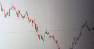

Over 70% of crypto traders look at a chart before checking the whitepaper. This shows how important it is to understand crypto charts as a beginner. It’s not just about numbers. It’s about seeing the story those numbers tell.
I’ve seen prices change on Coinbase Pro and Binance. I’ve noticed big volume changes on CoinGecko. Also, I’ve seen how news affects prices, which can confuse new traders. Charts help us see market trends by showing price changes, different timeframes, and trading volumes. But, they don’t show everything. Other important details like company basics, trading risks, and full order details are found elsewhere.
In this guide, I’ll explain what you can learn from charts and what they don’t show. I’ll give you real examples, explain how trading platforms work, and talk about where data comes from. Since each exchange shows prices a bit differently, the same price might not look the same everywhere.
Remember, charts show past trends. They help you make educated guesses, but they don’t predict the future. Always research on your own and make risk management your top priority.
Key Takeaways
- Charts are the market’s visual record — essential for quick decisions but incomplete on fundamentals.
- Data sources differ by exchange; prices and tick behavior can vary across platforms.
- Use charts to form hypotheses, not certainties; past action is not a future promise.
- Combine chart reading with independent research and strict risk management.
- This guide will teach basic cryptocurrency chart analysis steps and practical examples.
What Are Crypto Charts?
I began exploring charts when Bitcoin hit the news. To me, charts are like a map. They turn price, volume, and time into a clear image. This makes it simpler to find patterns than just looking at numbers.
Definition and Purpose
Crypto charts are visual tools that show asset prices over time. They display various data points like open, high, low, close, and volume. You can view them over different periods, from seconds to months. I use charts to identify trends, assess momentum, plan my trades, and compare today’s data with historical data.
Sites like Coinbase and eToro let users adjust their view with time selectors—1D, 1W, 1M, 6M, 1Y, MAX. But remember, past performance doesn’t predict future outcomes. Also, some information might be generated by AI or include opinions from analysts.
Types of Crypto Charts
Line charts simplify the look at price changes over time. They’re straightforward and useful for beginners or when giving a basic introduction.
Candlestick charts offer more insights. Each “candle” represents the open, high, low, and close prices for a set time. These details help traders pinpoint momentum and potential reversals. I rely on candlesticks for careful trade planning.
Bar charts are similar to candlesticks but have a classic feel. They pair with volume histograms to show market activity. For a deeper dive, I use overlays like moving averages or specific indicators for cryptocurrencies.
Renko and Heikin-Ashi charts are great for spotting trends by smoothing out short-term fluctuations. I use them along with a watchlist to compare different timeframes. This helps me understand crypto charts better.
Key Components of Crypto Charts
I remember my first time looking at a live Bitcoin chart and feeling overwhelmed. Over time, I broke the charts down into parts that tell a story. Now, I’ll share the key parts I focus on to interpret crypto price movements and how I explain these basics to friends.
Price Action
Price bars and candlesticks speak the market’s language. Each candlestick shows the open, high, low, and close prices. Wicks on the candlesticks show attempts or rejections of certain price levels. A long candlestick body indicates strong momentum, while a short one suggests hesitation.
I compare tick aggregation to candlestick aggregation. Ticks show every individual trade. Candlesticks group trades into readable time periods. Choosing the right timeframe tells the story you want to hear. A one-minute chart shows detailed movements. A four-hour chart highlights broader trends.
Looking at multiple timeframes is crucial. I start with the bigger picture to identify the trend and then drill down to find specific entry points. I used to get caught by misleading price jumps. But, I’ve learned to use volume and other indicators to avoid those mistakes.
Volume Indicators
Volume helps validate or question price movements. Breakouts with little volume often don’t last long. However, a high volume pullback usually shows strong market belief. I keep an eye on volume changes at support and resistance levels for hints.
Simple volume bars are effective. On-chain data from exchanges provides extra insight for cryptocurrencies. Matching volume with candlestick patterns gives a clearer image of price directions. This approach is fundamental to how I read crypto charts.
If you’re starting, pay attention to how price bars move at high and low points, and see if volume supports those moves. Making this a daily habit can turn reading crypto charts from a confusing task into a handy skill.
| Component | What to Watch | Why It Matters |
|---|---|---|
| Open/High/Low/Close | Body size, wick length, close position | Shows momentum, rejection, and trader sentiment |
| Timeframe | 1m, 5m, 1h, 4h, daily comparisons | Defines noise vs. trend and informs entry timing |
| Tick vs. Candlestick | Raw trades vs. aggregated bars | Tick data reveals microstructure, candles show broader patterns |
| Volume | Bar size, spikes, volume at price | Confirms moves, flags false breakouts, indicates liquidity |
| Multi-timeframe | Higher trend + lower entry charts | Makes setups align with larger market direction |
Understanding Candlestick Patterns
The first time I looked at a chart, I was confused. Candlesticks seemed like a mystery. But slowly, I figured out their language, essential for beginners learning crypto chart analysis. I started small, with one timeframe, then added more.
Let’s break down the basics into easier parts. I’ll explain what each candle shows about the market’s direction. Plus, why the same shape might mean different things on different chart timeframes. This turns beginner tips into practical skills.
Bullish vs. Bearish Signals
When a candle’s closing price is above its opening, it’s called bullish. If the close is below the open, it’s bearish. Colors like green and red, or sometimes white and black, indicate this. Always check your trading platform’s color scheme to avoid confusion.
Long candle bodies mean strong buying or selling activity. A big bullish candle shows buyers in control. A big bearish one means sellers had the upper hand. Long wicks indicate price rejection. For instance, a long upper wick on a bullish candle suggests selling pressure. I once mistook a long lower wick on a 1-minute chart for a buying opportunity. On a daily chart, it clearly showed rejection of lower prices.
Common Pattern Readings
Single-candle patterns are important. A hammer suggests a downtrend might be ending. An inverted hammer signals weakness. A shooting star after a price increase hints at a possible peak.
Patterns with two or three candles provide more insights. Engulfing patterns, where one candle completely covers the previous one, indicate shift in momentum. Morning and evening star patterns often signal a trend change is coming.
To get better at recognizing patterns, study real chart examples. I honed my skills using a detailed guide and example from this bear flag breakdown.
- Do match pattern signals with volume and higher timeframes.
- Don’t rely on a single candle to make big trades.
- Try journaling each pattern you see; note timeframe and outcome.
Pattern reading becomes powerful when combined with trend analysis and risk management. This knowledge is vital for reading crypto charts and is a key tip for beginners.
Reading Support and Resistance Levels
I often look at charts to find clear horizontal lines where prices stop. These lines work like informal floors and ceilings. They make understanding crypto market trends easier and clarify price movements for me.
Support zones are where buyers jump in to halt price falls. I search for spots where the price hits the same level many times, not just once. Round numbers, like $10,000 for Bitcoin, often act as mental markers. If lots of trading happens near these points, it shows strong interest.
Identifying Support Areas
To find support areas, I follow certain steps. First, I look at weekly and daily charts to spot repeated bounces. Using platforms like eToro and TradingView, I examine 1W, 1M, and 1Y charts. This helps me see long-term trends in the market.
Next, I count how many times the price touches these levels. More than two touches means I can be more sure. I also look at the volume to see if there’s lots of buying at those prices. If a big exchange like Coinbase has more activity than a smaller one, the support level is clearer. This makes it easier to understand price movements across different platforms.
Last, I think about the context: is the price at its lowest point recently or sitting in a stable range for a long time? That context is very important. For those new to reading crypto charts, this step connects chart patterns to actual market movements.
Recognizing Resistance Zones
Resistance zones are like caps that stop price rises. I watch for repeated pull-backs and less trading volume when prices go up. If prices keep stopping at the same level on different charts, that resistance is likely real.
Round numbers matter here too. Traders often choose these easy-to-remember levels to sell. I compare sites like Binance and Kraken to see where most orders are. Differences in trading volume can change the resistance level, so checking multiple platforms is useful.
When resistance breaks with lots of trading, it often means the trend is changing. Watching for this moment helps me stay on top of price movements. For beginners learning to read crypto charts, this is the time to blend pattern recognition with analyzing volume and timing.
| Step | What I Check | Why It Matters |
|---|---|---|
| Timeframe Scan | 1W, 1M, 1Y ranges | Reveals recurring supports and long-term context |
| Touch Count | Two or more bounces/rejections | Increases confidence in level validity |
| Volume Profile | Clusters at price zones | Confirms real buyer/seller commitment |
| Round Numbers | $10k, $50k style levels | Psychological anchors where orders group |
| Cross-Exchange Check | Compare Binance, Coinbase, Kraken | Accounts for liquidity differences that shift levels |
Utilizing Technical Indicators
I pick some reliable indicators to understand crypto charts better. These tools help make sense of the complicated price movements. For beginners, it’s about finding the right tools that fit your trading style and risk level.
Moving averages make price trends easier to see. I use simple moving averages (SMA) for general direction and exponential moving averages (EMA) for recent prices. They often range from 20, 50, 100, to 200 days. A sign of momentum change is a 50/200 EMA crossover. In some markets, prices stick close to the 50 or 200 EMA, acting as support or resistance. Remember, moving averages follow past prices. They don’t predict the future.
RSI and MACD show momentum in different ways. The RSI indicates if something is overbought or oversold. If it’s over 70, there’s likely a lot of buying. Below 30 indicates selling. MACD looks at the gap between fast and slow EMAs. Its histogram helps spot good times to enter or leave the market.
Start with combining these indicators with price trends and volume. Trust a bullish EMA crossover more when RSI goes up and volume increases. Practice with old charts before investing.
Using short checklists keeps me on track:
- Check the trend with a 50 and 200 EMA.
- Look at RSI levels to gauge momentum.
- Find good times to trade with MACD.
- Confirm your hunches with volume and other signs.
Think of indicators as helpful hints, not the ultimate answer. Applying the basics of crypto analysis and trading tips has made me a better trader. Hands-on experience takes the mystery out of reading crypto charts.
Analyzing Trends in Crypto Markets
I start each day by looking at crypto charts. This routine helps me tell important signals from less important noise. Spotting clear trends makes decisions easier. In choppy markets, patience is key.
A simple rule kicks things off: higher highs and lows mean a bullish trend. Lower highs and lows indicate bearish times. I mention this to beginners because it’s basic to understanding charts.
Markets can shift between trends. A trending market will follow certain averages and lines. But in undecided markets, tools like RSI just jump around without clear direction. This is key for managing trades.
Bull Markets and Bear Markets
In a bull market, buyers jump in during dips. Trading volume usually goes up with the price and drops when the price corrects. Watching these patterns helps me decide when to trade more.
In bear markets, price rallies often stop at known resistance levels. Then, selling gets stronger. Spotting these trends is crucial for managing risks and setting trade goals.
Trend Reversals
Reversals often show up as a break in pattern. For example, an uptrend turning into a downtrend is a warning sign. I use chart patterns and bigger economic indicators to read these signals better.
The big economic picture is also key. Things like central bank actions, the value of the dollar, and investments in safe havens like gold can affect crypto. I keep track of these with the crypto indicators for a full picture.
For those new to reading crypto charts, start with the basic patterns. Recognize the signs of up and down trends. Then, use more tools and economic insights to get better at entering and exiting trades.
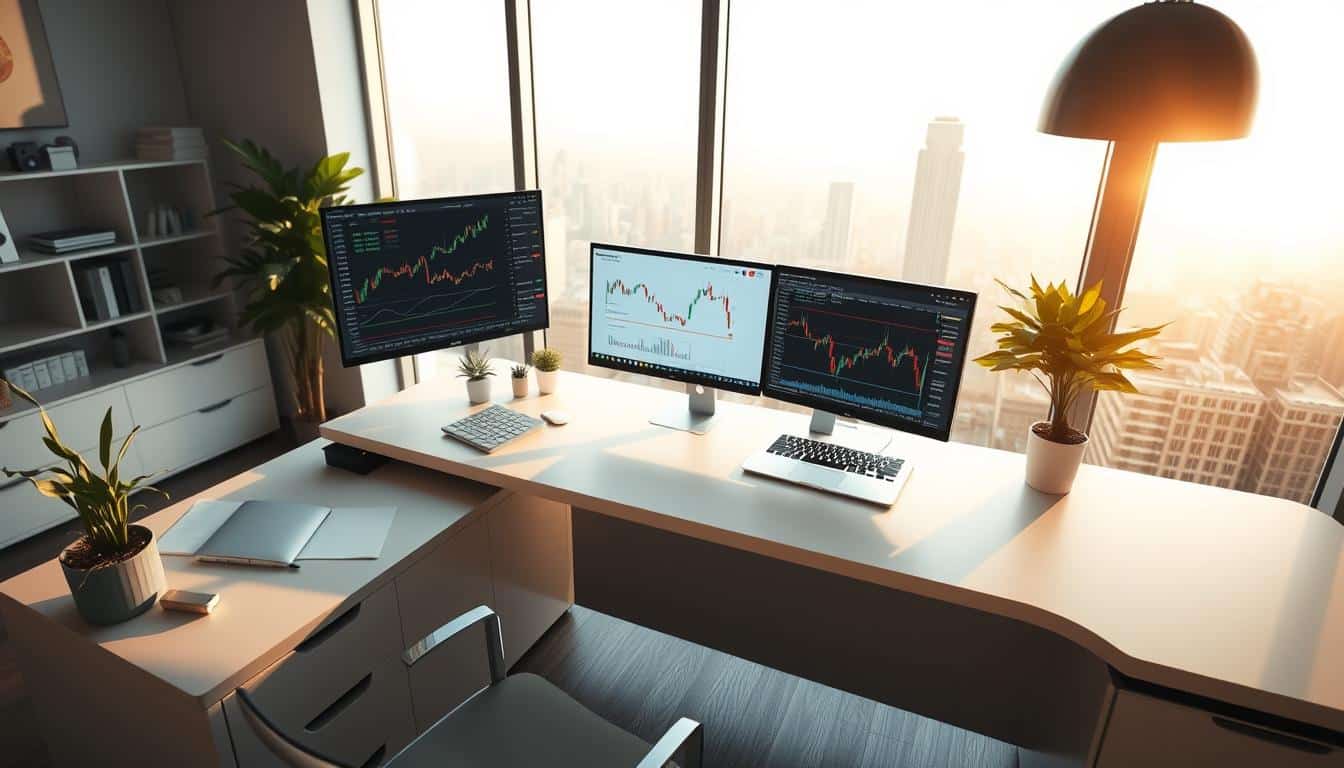
Introduction to Charting Tools
I always go back to a few trusted tools when studying markets. Picking the best tools for crypto chart analysis made my work quicker and more accurate. This guide will show the platforms I prefer, highlight their best features, and give you simple steps to start reading crypto charts today.
Popular Platforms for Chart Analysis
TradingView is top on my list for detailed charts and community-driven scripts. It has drawing tools and alerts that make recognizing patterns much easier. For charts that are built-in to exchanges, I use Binance and Coinbase Pro. They’re great for seeing real-time trades. For overall market trends, I look at CoinGecko and CoinMarketCap. They’re great for understanding supply, market cap, and general trends. Finally, eToro offers easy-to-use charts and time ranges good for quick looks and testing out strategies.
Some broker sites and eToro provide AI summaries and warnings about past performances. I see them as hints but not facts. Checking the facts with primary charting tools helps avoid mistakes as I learn to read crypto charts as a beginner.
Features to Look For
Start with fast, easy-to-use charts that can show different time frames. Being able to switch from 1-minute to weekly views quickly is crucial for spotting trends. The quality of indicators is also key. I prefer platforms that have RSI, MACD, several types of moving averages, and support for custom scripts.
Features like order entry and alerts are crucial for trading. I choose platforms that allow me to set alerts based on certain conditions and save my settings. Being able to download data for offline analysis helps me refine strategies. A clean and simple interface is best for focusing on crypto charts during long sessions.
If you’re starting out, stick with one platform and get to know it well. Learn how to draw trend lines, read volume, and use indicators. Practicing these techniques with reliable chart analysis tools will build your confidence more quickly than jumping between different apps.
Statistical Insights from Crypto Charts
I begin by quickly checking numbers before I make a trade decision. Statistical tools transform basic price charts into useful info. Here, I’ll share steps for analyzing past crypto data and how it connects to what happens in the world.
Historical Data Analysis
First, get CSV files from exchanges or fetch data through APIs for different markets. I perform simple tests on this data to calculate the average true range (ATR), volatility, and the biggest drops over specific periods. These calculations aid in deciding stop levels and how big my trades should be.
It’s best to focus on recent data because old data might not show current trends. Plus, I watch out for survivorship bias when creating index histories and I remove data that seems too unusual.
Correlation with Market Events
After preparing the metrics, I look at how big moves or drops match up with news or big transactions. This helps me see how different events affect the market. For example, I find connections between prices, big news, exchange issues, or large transactions. I point out where these links are clear, especially with big money flows and market changes.
When talking about big shifts in money and how people are starting to use crypto more, I look at articles. Like this one, which talks about new money trends in Australia and other places. You can read about it here.
- Step 1: Clean timestamps and align time zones.
- Step 2: Compute ATR, volatility, and drawdown for chosen windows.
- Step 3: Tag major calendar events and exchange incidents.
- Step 4: Run simple correlation matrices between price moves and tagged events.
When analyzing crypto charts, it’s key to remember their predictive limits. While past data can hint at trends, changing markets and guesswork make absolute predictions tough. I’m all for trying small, step-by-step improvements instead of making big claims.
Making Predictions Based on Charts
Charts are like tools for me, similar to how a pilot relies on instruments. They guide but don’t decide for me. They help assess risks in trading moves.
Short-Term vs. Long-Term
Short-term crypto forecasting focuses on the immediate. Day traders obsess over every minute and hour. They look at volume and how quickly things can change.
They manage risks closely. Stops are common. Unpredictable swings in price can happen, especially on certain trading platforms.
Long-term forecasts, however, look at broader trends. Experts examine user growth and big picture cycles. Longer trends help see beyond daily ups and downs.
What Moves the Forecast
High trading volume hints at stronger market belief. But watch out for breakouts that don’t match up with volume. I look at trades and how different exchanges show them.
What happens in the world influences long-term predictions. New rules, big exchanges, and big investors change things. Data on how many use the network also helps me see clearer.
Issues specific to platforms can disrupt short-term forecasts. Knowing how to read charts is key. Start by understanding volume and how to use timeframes.
Practical Steps I Use
- Pick a timeframe and stick to it for a trade. Short-term crypto forecasting uses 1m–1h charts. Longer trades need daily to monthly views.
- Compare multiple timeframes before sizing a position. A daily trend can override an hourly signal.
- Confirm breakouts with volume and visible order flow. If either is missing, treat the move as suspect.
- Log trades and review them weekly. Patterns emerge over months, improving your long-term crypto predictions.
For newcomers: start simple. Master the basics of candles, volume, and one key indicator. This makes learning focused and effective.
Frequently Asked Questions (FAQs)
I often answer the same questions from folks who are new to crypto. Here, I’ve addressed the most asked ones with direct steps and real warnings. If you’re looking for clear advice on starting with crypto charts and beginner trading tips, this is for you.
How do I start reading crypto charts?
Begin with choosing a trusted platform like TradingView, Binance, or Coinbase Pro. Pick a timeframe that aligns with your trading goals. Choose 5–15 minute charts for day trades. Opt for 4H or daily charts for longer swings.
Make sure to enable candlesticks and volume. This helps you see price movement and how many people are buying or selling. Add a 50 EMA and RSI (14) to your chart setup. The 50 EMA shows the trend direction, while RSI points out momentum and if a crypto is over or underbought.
Get good at identifying recent price swings and drawing lines for support and resistance. Track just a few pairs at the start. I began with paper trading, then moved to small live trades. This approach helps build skill without big risks.
Be cautious with platform advice. Many sites warn that past results don’t predict future performance. Some summaries might be automatic or AI-generated, needing cross-checking. Don’t follow one indicator as an absolute. Charting helps form an opinion, not make a decision for you.
What should beginners focus on first?
Stick to the basics first: understanding candles, volume, trends, and simple indicators. You should learn to see uptrends through higher highs and lows, and downtrends through lower highs and lows. These are crucial for reading crypto charts.
Use these tips in every trading session. Keep a diary of your trades and the reasons behind them. Look over your losses without making it personal. Over time, you’ll recognize patterns more quickly. Start with small, manageable trades. Consistent learning, not taking big risks, is your path to growth.
Here’s a simple checklist for when you look at a chart:
- Choose platform and timeframe.
- Enable candlesticks and volume.
- Add 50 EMA and RSI (14).
- Mark recent swing highs and lows.
- Identify clear support and resistance.
- Paper trade, then scale up with small stakes.
Resources for Further Learning
I have a go-to list for improving chart skills. It balances theory with practice. It took me from beginner to doing hands-on charting in crypto analysis.
Recommended Books and Courses
John J. Murphy’s Technical Analysis of the Financial Markets gives a solid base. Steve Nison’s Japanese Candlestick Charting Techniques helps understand patterns in volatility.
I like courses on Coursera, Udemy, and eToro Academy because they’re often updated. I choose recent classes to ensure the content reflects the latest market changes.
Online Communities and Forums
Peer feedback on Reddit and TradingView sped up my learning. The r/CryptoCurrency space is good for testing ideas. Active discussion shows how theory works in real-life trading.
Telegram and Discord have focused groups with valuable chart threads. These communities offer quick feedback and highlight new tools.
Here’s a quick guide to decide where to start.
| Resource Type | Example | Best For | Notes |
|---|---|---|---|
| Books | Technical Analysis (John J. Murphy) | Foundational theory | Comprehensive, timeless concepts for chart reading |
| Books | Japanese Candlestick (Steve Nison) | Candlestick patterns | Practical pattern recognition and examples |
| Online Courses | Coursera / Udemy / eToro Academy | Hands-on tutorials | Pick courses with recent revisions and labs |
| Charting Platforms | TradingView | Real-time charting practice | Scripts, public ideas, and replay tools |
| Forums & Chats | Reddit, Discord, Telegram | Peer feedback | Fast answers, trade ideas, community-driven learning |
| Aggregated Resources | Curated reading lists and playlists | Structured learning path | Combine books, courses, and community input for best results |
Conclusion: Becoming Proficient in Reading Crypto Charts
I’ve spent years learning about candle patterns, testing indicators, and practicing on TradingView. Mastering crypto charts is a journey, not a quick win. You have to work at it every day. Keep a trade journal and always review your mistakes. This way, small daily steps can lead to big improvements over time.
Continuous Learning and Practice
To get better, use tools that let you practice with real market scenarios. I look at past Bitcoin and Ethereum trends, spot patterns, and learn from errors. Improving in crypto trading means constantly tweaking your strategy. You adjust your moves, control your emotions, and base decisions on data. Even big players like central banks update their strategies, as seen with their gold buying habits.
Markets keep changing, and so should your trading rules.
Staying Updated in a Dynamic Market
Keeping up with the fast-paced crypto world means blending news, data, and analytics. I focus on key developments, how money flows between exchanges, and broad market signals. Choose reliable news sources and stay ready to adjust your strategies. This combination of disciplined practice and staying informed will make your skills last.